Why This Update Actually Matters (Spoiler: It’s Not About Pretty Pictures Anymore)
Listen, I get it. We’ve all seen countless articles promising that the latest AI will “revolutionize” how we create images. Usually, it’s just… another art generator. Pretty? Sure. Useful? Not really.
But this one is different.
The latest update to Nano Banana Pro (NBP) just dropped something that honestly blew my mind. And I don’t say that lightly. This isn’t about creating gallery-worthy artwork anymore—this is about making complex information simple, clear, and actually usable.
Think about it this way: anyone can generate art. But how many tools can take a complicated concept and explain it visually in a way that actually makes sense? That’s the real breakthrough here.
Table of Contents
Part 1: The X-Ray Vision Nobody Knew They Needed
When a Picture Really Is Worth a Thousand Words
Let me show you what I mean.
I asked NBP to create a structural breakdown diagram of a desktop computer. Here’s what it generated—and honestly, it was stunning.
The prompt: “Create a structural breakdown diagram of a desktop computer.”

The result? A crystal-clear diagram that shows every component and how it fits together. No guesswork. No confusion.
Then I tried something more ambitious: a detailed car parts diagram with labels.
See also: Mastering the Linux Command Line — Your Complete Free Training Guide
The prompt: “Create an exterior structural breakdown diagram of a family sedan with detailed component labels.”
And it nailed it. Every part labeled. Every relationship clear.
Why this matters: For the first time, anyone can understand complex hardware. You don’t need to be a repair technician. You don’t need years of experience. You just need one question: “Show me how this works.” The AI does the rest.
From Videos to One Perfect Image
Here’s something that happened to me personally that made me realize how powerful this is.
I’ve never actually learned how to tie a necktie properly. (Yes, I know, it’s embarrassing. That’s why I usually just wear a bow tie. 🙈)
Whenever I tried to learn, I’d find a YouTube video. Then I’d pause it. Then I’d try to mimic the movements while my hands flailed around uselessly. It was a disaster.
But then I asked NBP: “Create a step-by-step sequence diagram for tying a necktie.”
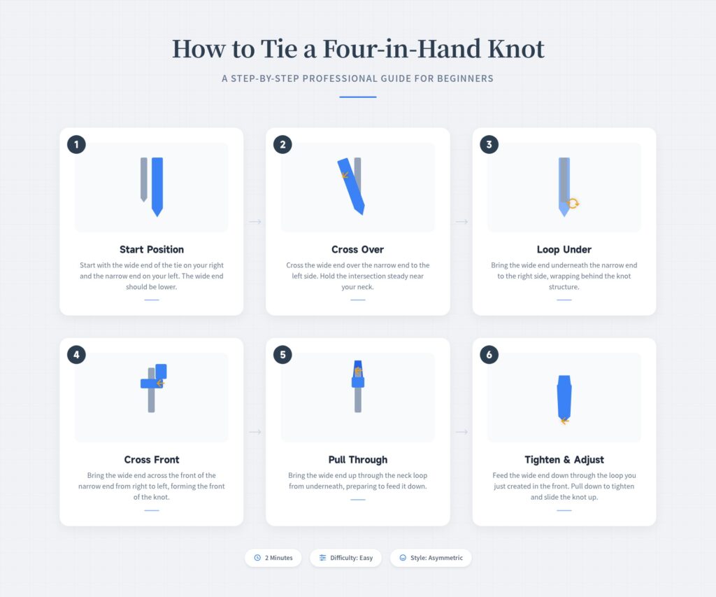
In seconds, I had a single image showing every movement, every fold, every step. Not a video I had to pause and rewind. Not written instructions I had to parse. Just one beautiful, clear diagram.
Same thing with folding a dress shirt. All the fold lines. All the hand positions. Everything visible at once.
Here’s what really blew my mind though: I never told the AI the specific steps. I never said “first do this, then do that.” I just said what the end goal was. The AI looked into its knowledge base, figured out the logical sequence, and drew it all out.
That’s real intelligence.
Making Anyone a Science Communicator
Want to know what content creators on platforms like Xiaohongshu are obsessed with?
Spoiler: it’s not thousands of words. It’s clear, beautiful process diagrams.
How to make bread. How to cook the perfect pasta. How to start a garden. You don’t want to read about it—you want to see it.
The prompt: “Create an infographic showing how to make bread, in English, 16:9 aspect ratio.”
And boom. Complex baking instructions transformed into a clean, simple visual guide. Even someone who’s never set foot in a kitchen could follow this.
This is the kind of practicality that changes how we share knowledge.
Part 2: It’s Not Just Drawing—It’s Actually Thinking
The Real Magic: Understanding Abstract Concepts
Here’s where it gets really interesting. NBP doesn’t just draw physical objects. It understands and visualizes abstract ideas.
That’s what makes it truly revolutionary.
Knowledge Maps That Actually Make Sense
Ever read an article about something complicated, like medical science, and feel like your brain is melting? You know all the words individually, but strung together, they’re meaningless.
The prompt: “Create a hierarchical diagram showing the five main causes of high blood pressure and their relationships.”
The result was stunning. Instead of dense paragraphs, I got a visual map showing how these factors connect and influence each other.
Suddenly, the whole picture made sense. Not from reading, but from seeing.
Navigation for People Like Me (The Completely Lost)
Here’s one I’m personally excited about.
Ever been in a subway station in an unfamiliar city and just… frozen? You know which train to take, but you don’t know which exit to use, or how to get from the platform to that exit efficiently.
The prompt: “Create a diagram showing the shortest transfer route from the ticket gate to the nearest exit near the train platform.”
This kind of “shortest path” visualization could transform how we navigate cities. Less anxiety. More efficiency. Better journeys.
Making Theory Actually Interesting
I wanted to learn about photography composition, but I really didn’t want to read a boring textbook. So I asked NBP for something different.
The prompt: “Create a poster with cinematic, photorealistic visuals that explain the most common photography composition techniques (rule of thirds, leading lines, symmetrical composition).”
What I got back was essentially a cinema-quality visual tutorial. All those “rules” that usually feel abstract? They came alive in actual images that showed why they work.
That’s how learning should feel.
Part 3: When Useful Becomes Fun (And Sometimes, Life-Saving)
The One That Literally Could Save Lives
If I had to pick the most important use case, this is it.
The prompt: “Create a detailed diagram showing CPR technique for adults, including hand placement and step-by-step actions.”
In an emergency, who has time to flip through a manual? Who can remember written instructions when they’re panicking?
One clear, precise, no-nonsense diagram—that could mean everything.
NBP stripped away all the artistic flourish and focused on one thing: being absolutely clear and correct. That matters when lives are on the line.
Turning Boring Data Into Visual Gold
Anyone who’s made a PowerPoint knows the pain: you’ve got a spreadsheet full of nutrition data, and you need to present it. Nobody wants to stare at numbers.
The prompt: “Create a quantitative distribution diagram showing sugar content and vitamin C levels across five common fruits.”
Suddenly, that dry data becomes colorful, clear, and actually interesting. You can compare at a glance. You can make better decisions.
This isn’t just prettier—it’s genuinely more useful.
A Decade of History in One Frame
The prompt: “Create a visual timeline showing how iPhone designs have evolved from the first generation to today.”
Instead of hunting for old photos online or asking a designer to spend hours on this, NBP compressed an entire product history into one stunning visual timeline.
Perfect for product reviews. Perfect for nostalgia posts. Perfect for understanding how design evolves.
When Styles Collide (And It Actually Works)
Here’s where I decided to test the limits.
The prompt: “Create a map showing Tang Sanzang’s journey from Chang’an westward to seek Buddhist scriptures, styled like Rick and Morty.”
I honestly wasn’t sure this would work. How do you blend serious historical geography with that absurdist cartoon style?
But NBP did it. The historical accuracy? Still there. The wacky Rick and Morty vibe? Perfectly captured. It was hilarious and informative.
The point: this tool can balance accuracy with creativity in ways I didn’t think possible.
Part 4: Pushing the Boundaries
When “Fun Learning” Gets Playful
The prompt: “Create an adorable cartoon-style poster about ocean depth zones, showing the five major regions from the sunlit zone to the hadal zone.”

The result was charming enough to keep a kid’s attention for hours. Educational, yes—but also genuinely fun to look at.
That’s the holy grail of educational content: you learn without it feeling like work.
Turning Data Into Gossip
Science facts are boring when they’re just numbers. But package them right?
The prompt: “Create a solar system infographic with an interesting fact labeled for each planet, 16:9.”
Instead of dry data, I got something that felt more like fun trivia. Like someone was telling me the “tea” about each planet. Suddenly, astronomy was interesting again.
Part 5: The Test That Changed Everything
Here’s where I decided to push things to their absolute limit.
What if I took a complex book—something with hundreds of pages of dense material—and asked NBP to distill it into a single, beautiful infographic?
Honestly, I didn’t think it would work. This requires serious reading comprehension, synthesis, and the ability to restructure complex ideas into a visual format.
The prompt: “Summarize the core concepts of this book into a english language infographic with a modern, elegant design, 21:9 aspect ratio.” (And I pasted the entire book content.)
The AI actually did it.
It took hundreds of pages of complex theory and created a knowledge map that made everything crystal clear.
In that moment, I realized: this isn’t just a tool for making pictures. This is a tool for making knowledge accessible.
The Real Revolution: From Art to Utility
Here’s my honest take after testing this extensively:
The AI image generation world just split into two camps:
- Before: Tools that made pretty pictures (fun, but… so what?)
- After: Tools that solve actual problems (actually useful)
NBP has crossed that line.
You’re no longer just creating art for the sake of it. You’re:
- Explaining complex systems to people who need to understand them
- Making learning faster and more enjoyable
- Creating visual guides that save time
- Sometimes, literally potentially saving lives
Whether you need an emergency CPR reference, want to master a new skill, or just want to make boring information interesting—this tool has an answer.
So What’s Next?
The tools that will matter in the future aren’t the ones that make the prettiest pictures. They’re the ones that make complicated things simple.
This is that tool.
Stop struggling with confusing manuals. Stop drowning in dense explanations. Stop trying to find that one YouTube video that actually explains it clearly.
Just ask an AI to show you. Make it clear. Make it beautiful. Make it make sense.
That’s the revolution we’ve been waiting for.
Your Turn: What would you create with this? A visual guide for something you’ve always wanted to learn? A diagram that would make your work easier? A concept that’s always been hard to explain?
Drop your ideas in the comments. I’d love to see what you come up with.
And if this got you thinking—seriously, smash that like button, share this with someone who’d appreciate it, and let’s change how the world learns together.
See you next time! 🚀